


Browse Page Template
Browse Minutes
+31%
Browse Playback Rate
+24%
Browse Video Plays
+20%
THE OPPORTUNITY
Today, our browse pages are where users can look through the entire Paramount+ content library, and apply filters to find titles that fits their interests. The filters today manifest as genres that allow the user to filter down a grid of content. While this is helpful for finding content of interest, it still isn't enough to help the user make a decision on what to watch as indicated by the high bounce rates.
The Challenge
Design a scalable page structure flexible enough to provide users with the controls and context they’ll need to sufficiently guide them in their decision-making process when browsing for content in existing and future use cases. Applications for this page include, but are not limited to, browsing for shows, browsing for movies, and browsing for collections.
My ROLE
Lead Product Designer
Scope & Ownership
UI, User Flows, IxD, Prototype, Usability Test, Handoff
THE Team
Product Manager, Product Director, 20+ Engineers/QA
Platforms
All TV (tvOS, Android TV, Roku, Smart TV, STB, PlayStation, Xbox)
The Problem
Defining pain points
Business problems
- The Shows and Movies pages rank among the top 3 in highest % of new content discoveries of all discovery sources across the experience, however, the gap between this value and the values of the next highest ranked discovery sources is much wider than we’d like to see.
- High bounce rate, especially considering the Shows and Movies pages rank among the top 4 in engagement among all primary navigation items.
- The high CTR on nav tiles surfaced on homepage that link users to curated collections/hubs of shows and movies indicates a potential missed opportunity to offer users a centralized location to browse all curated collections/hubs.
User problems
- The browsing experience on the Shows and Movies pages fails to offer key information about each title to guide users in their decision making process. This requires lots of back and forth between browsing for titles and examining details pages for users to decide what to watch.
- The volume of the P+ content library is too high for the existing genre filters to suffice on their own in guiding users toward finding the type of content they're looking for.
- Curated collections of shows and movies can aid the decision-making process by helping users refine their browsing experience to align with their preferences. Currently, however, there is no intuitive way of re-accessing these collections surfaced throughout the discovery experience.

Previous "Shows" Page
Previous "Movies" Page
EXPLORATIONS
Scoping the solution space
User testing: Exploring content layouts
.png)
Hub carousels only vs. Hub carousel + Bifurcated carousels
Bifurcated carousels only: no subav bar vs. subnav bar
- Users seem to prefer seeing a glimpse into the content that will be included in each collection before committing to browsing a particular collection, as indicated by the preference for the bifurcated carousel UI from the usability tests.
- While users can see more collections at once with the multi nav tile layout, the amount of time it took for users to find the specified collection in both usability tests was significantly higher with the multi nav tile prototype than it was with the bifurcated carousel prototype.
- Although the bifurcated carousel layout requires more scrolling to see more collections, users noted they found it easier to identify each collection at a glance by simply being able to look at the distinctly styled promo/nav tile in the first position of each carousel in the bifurcated carousel prototype. Users also noted that the carousel header and accompanying content tiles also made it easier to immediately understand the meaning of the collection.
WHERE WE LANDED
Picking a direction
Templatizing Shows, Movies & Collections Pages
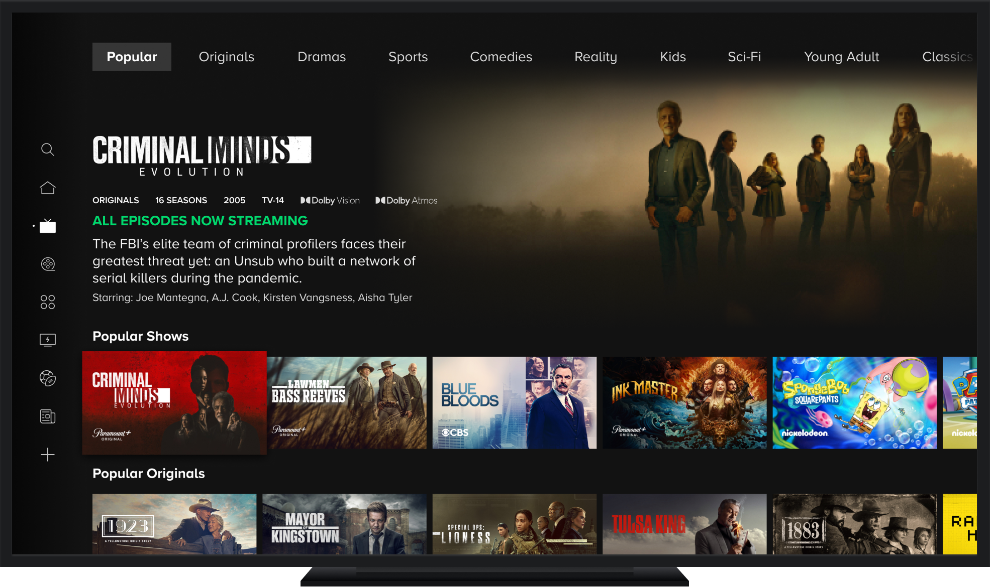

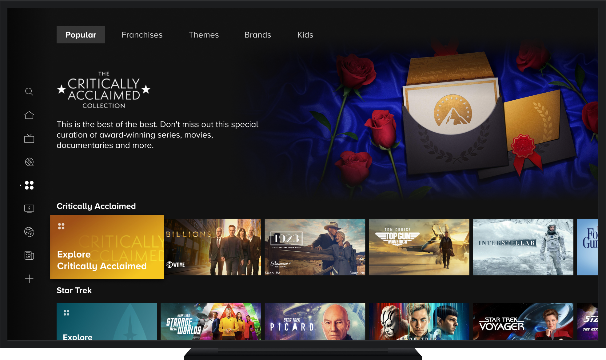
- Based on the usability test results, we found users responded best to page navigation that is consistently easy-to-access at the top of the page vs relying solely on navigation entry points within the scroll trajectory.
- We also found that users strongly prefer the bifurcated carousel format over the multi-nav tile carousels and grids with users highlighting how it was easier to locate the entry point into the collection with it always being in the first tile position.
- Additionally, users indicated their preference for the additional context provided by the Content Highlight video preview experience and appreciated that they could use this experience to explore titles from a collection before diving into the actual collection page.
Prototypes


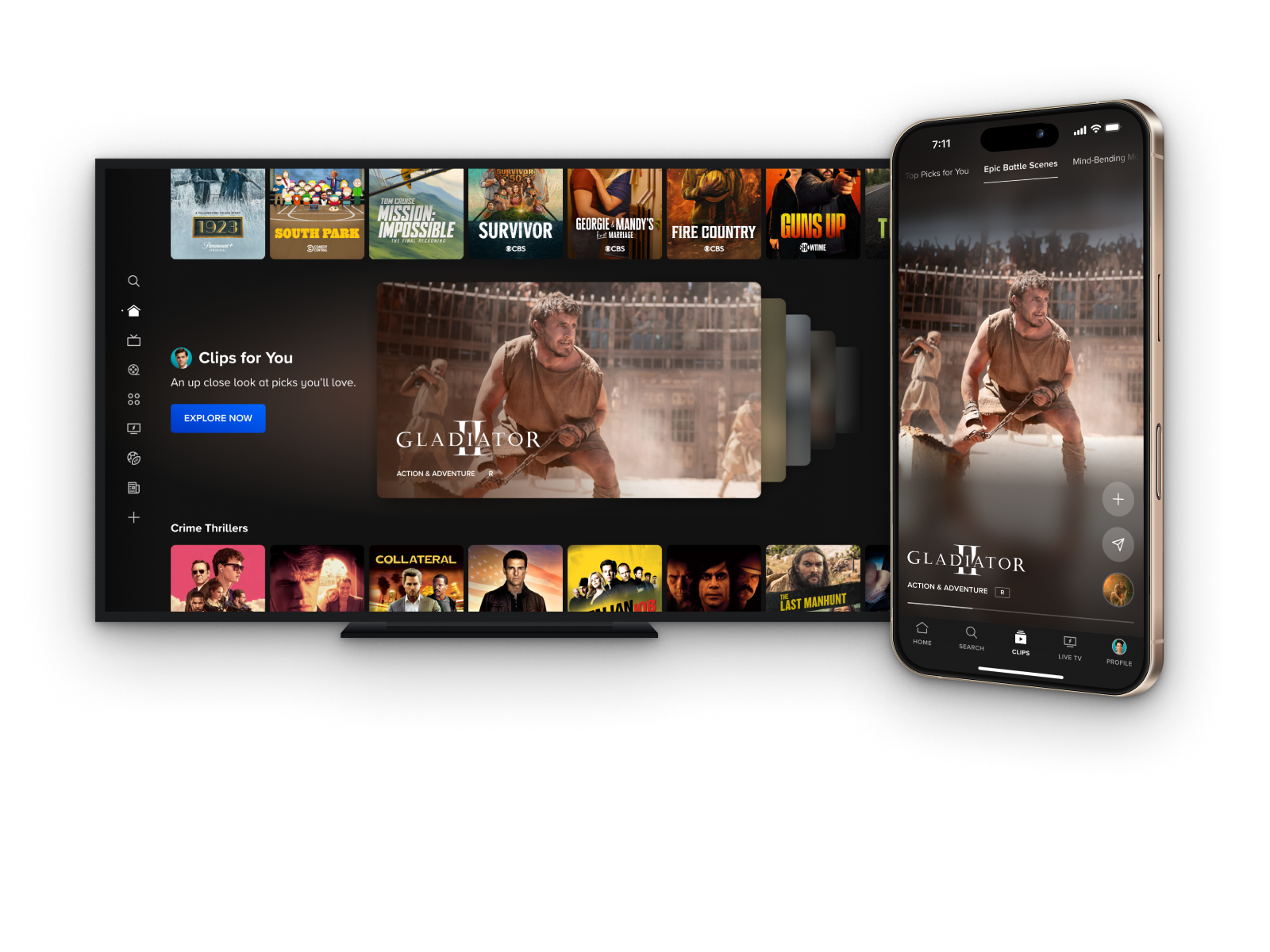
.png)