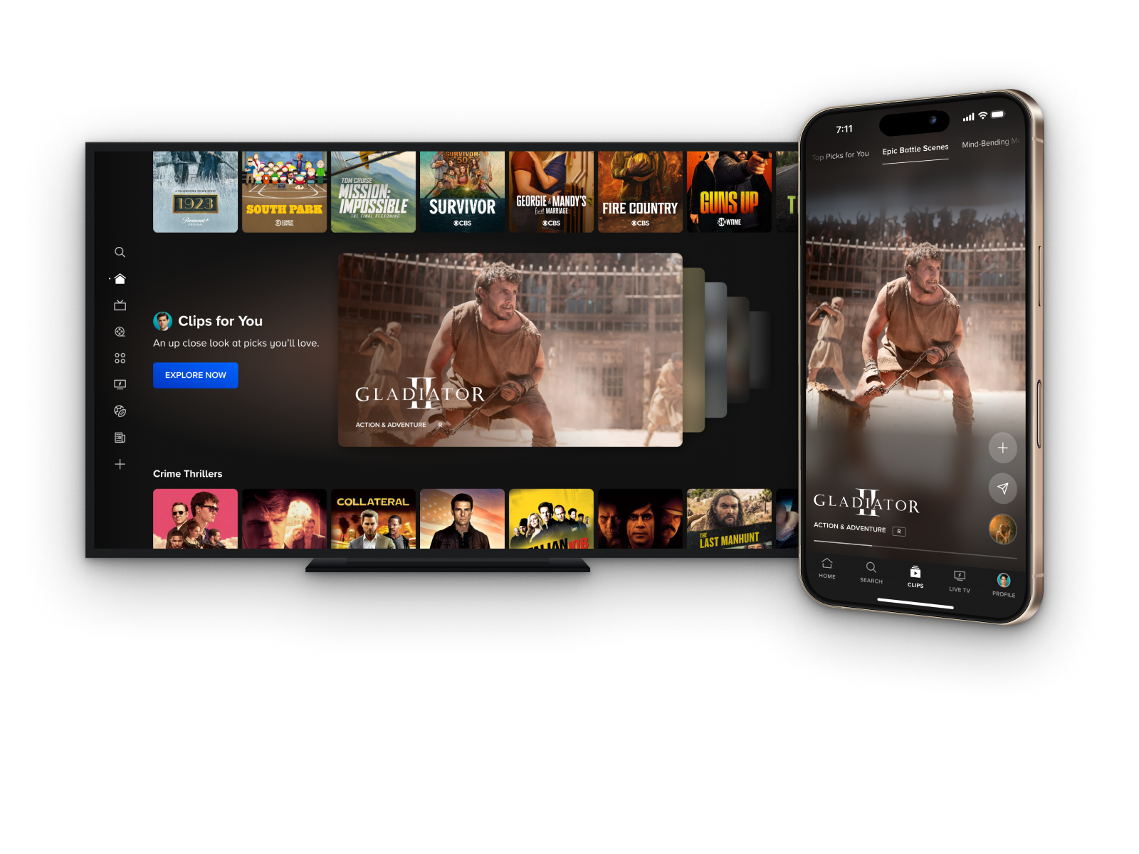
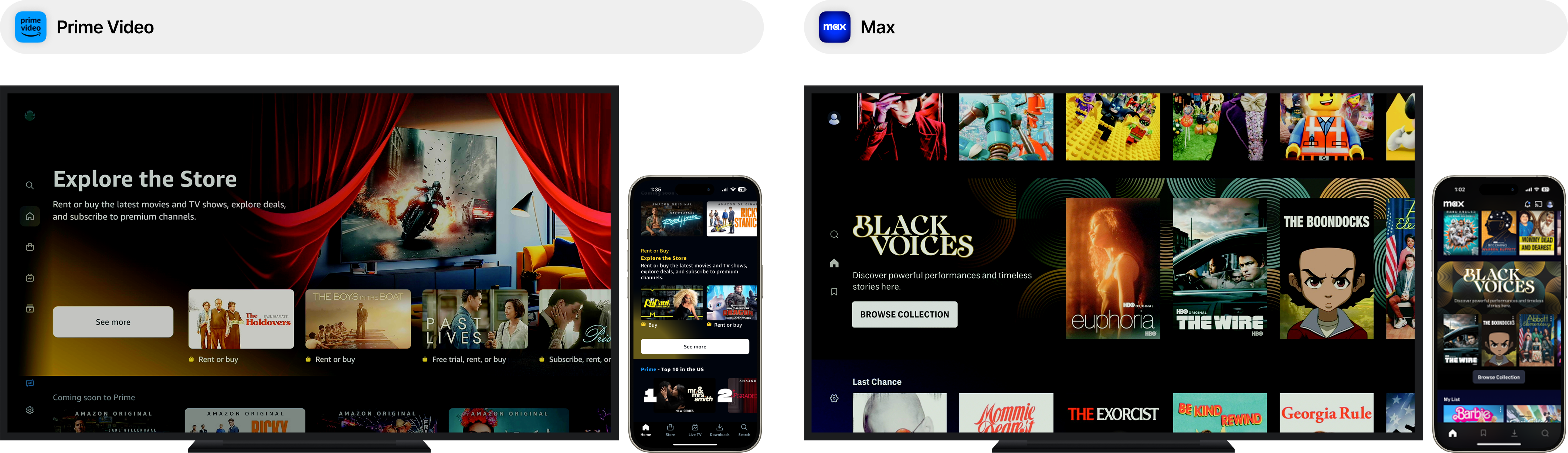
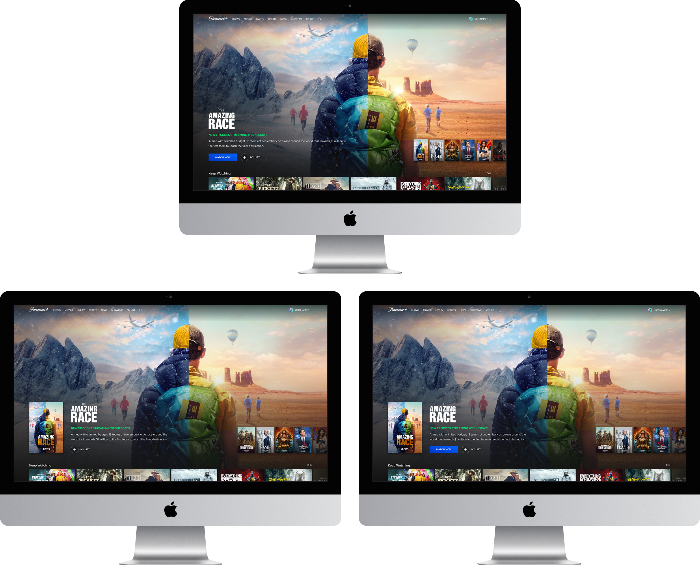
Personalized Hero
Hero CTR
+92%
Hero My List Button
+51%
Avg Video Plays
+44%
Top performing iOS A/B test results
THE OPPORTUNITY
The hero module is a core discovery element that shapes users' first impressions of Paramount+. The hero received little engagement and drove only a small fraction of content discovery. We saw an opportunity to rethink how we showcase content in the platform's most prominent surface.
The Challenge
Consider what we’ve learned about areas of our discovery experience that have proven successful, and how we could apply this to surface content in a way that’s more consistent with the discovery experience, yet uniquely takes advantage of the additional real estate. We want this design to drive more clicks, content discovery, and average minutes watched.
My ROLE
Lead Product Designer
Scope & Ownership
UI, User Flows, IxD, Prototypes, Handoff, Competitive Analysis, Experimentation Strategy
THE Team
Product Manager, Product Director, 20+ Engineers/QA
Platforms
All TV, iOS, iPadOS, Android Mobile & Tablet, Web
The Problem
Defining pain points
Business problems
- The marquee underperforms relative to its prominence, with low CTR driven in part by CTA labels that create ambiguity around what clicking will do
- A single "Watch Now" CTA fails to serve users at different stages of intent, leaving engagement on the table for both ready-to-play and still-browsing users
- The marquee serves primarily as a marketing tool, lacking the personalization and contextual awareness needed to reflect where a user actually is in their viewing journey
User problems
- Pagination indicators offer no visibility into what content is coming next in the marquee, placing the burden of discovery entirely on the user.
- "Watch Now" creates hesitancy by implying immediate playback, causing users to avoid clicking even when they're interested in the content
- The absence of contextual signals makes the marquee feel like it's broadcasting Paramount's agenda rather than responding to the user's own history and intent
RESEARCH
Gathering insights
Competitive analysis takeaways
- Many competitor examples of intragrid spotlight units tend to opt for displaying content items in a carousel format vs displaying pagination controls like many examples we've seen of hero marquees.
- These nested carousels are often recycled carousel components already seen throughout the rest of the discovery experience.
- Surfacing multiple content items at this level (within the unit) can give users a clearer understanding of the type of content they will find in this collection before committing to exploring further. This follows the same logic that has proven successful at Paramount+ as far as why we surface content in a carousel format throughout our discovery experience.
Missed opportunity
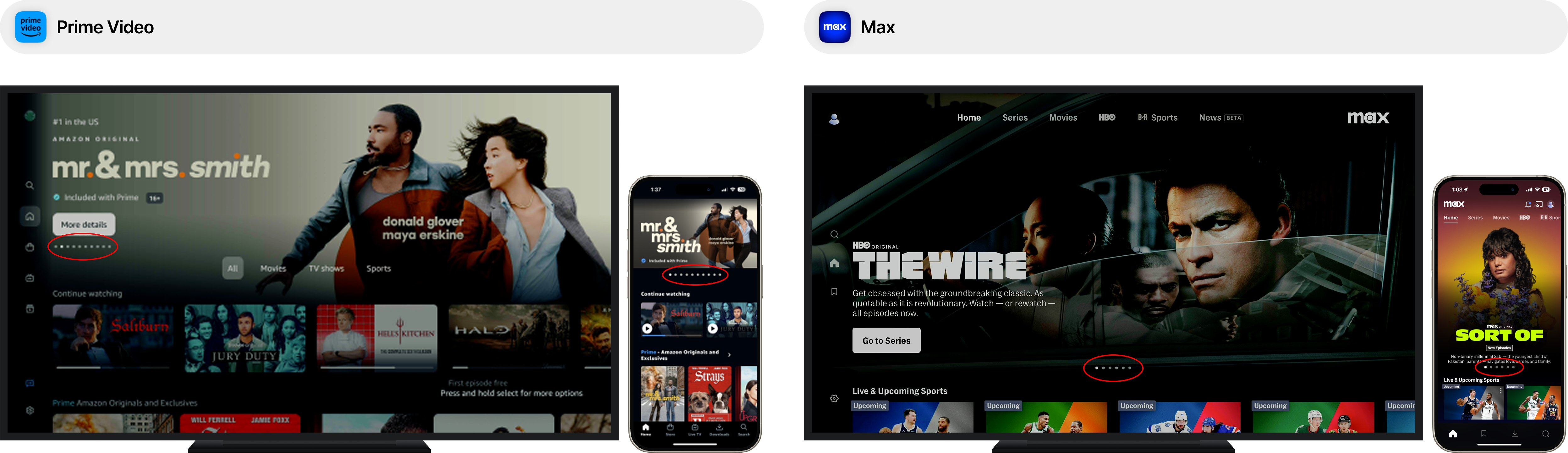
- Competitors consistently rely on pagination controls in the hero marquee, forfeiting the discovery signal that peeking content UI provides. Showing the next title creates an implicit invitation to explore while showing a dot count does not.
- Peeking content patterns reduce cognitive load by replacing an abstract count with a concrete glimpse of what is next, turning a passive indicator into a discovery prompt.
Early test results
.png)
- Phase 1 consisted of a test focused specifically on measuring the impact of the "peek ahead" UI to track any changes in CTR, % of new content discovery, minutes watched, and video plays.
- Marquee Content Discoveries: +26%
- Marquee Video Mins: +17%
- Marquee CTR: +15%
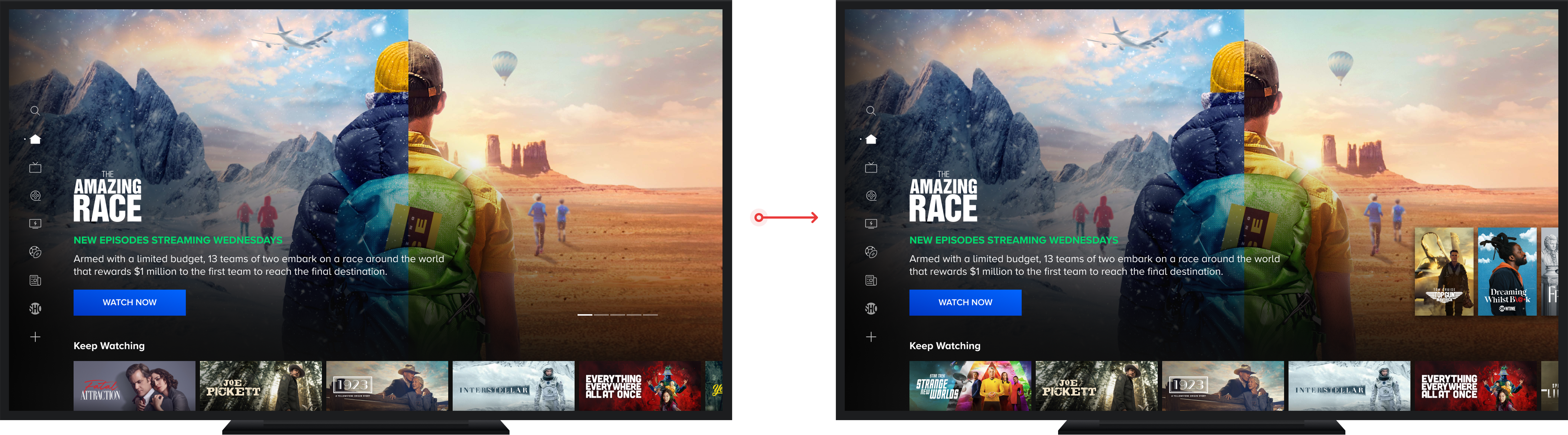
EXPLORATIONS
Scoping the solution space
.png)
- The sizing of the posters peeking off the right edge of the viewport needed to be thoughtfully considered to avoid them invading the safe zones of the background artwork while also keeping large enough to be legible from 10ft away.
- The difference in overall sizing of the active poster on the left and the peeking posters on the right needed to be distinct enough to easily identify the left poster as the active item
- The active poster needed a clear visual treatment that affords a selection interaction as an entry point into the content while visually separating it from the left peeking poster
- Given we had no predefined visual patterns in our mobile app design system for a "peek" UI, I had to start from scratch
- Challenges centered around establishing a mobile "peek" UI while maintaining the rich, full view artwork background that was a foundational part of our design system
- The peek element needed to be clearly legible against the background artwork which led to explorations involving color extraction and filter effects to achieve a card overlay that allowed natural colors from the artwork to come through without compromising accessible.
TECHNICAL Challenges
Building mobile peek ahead
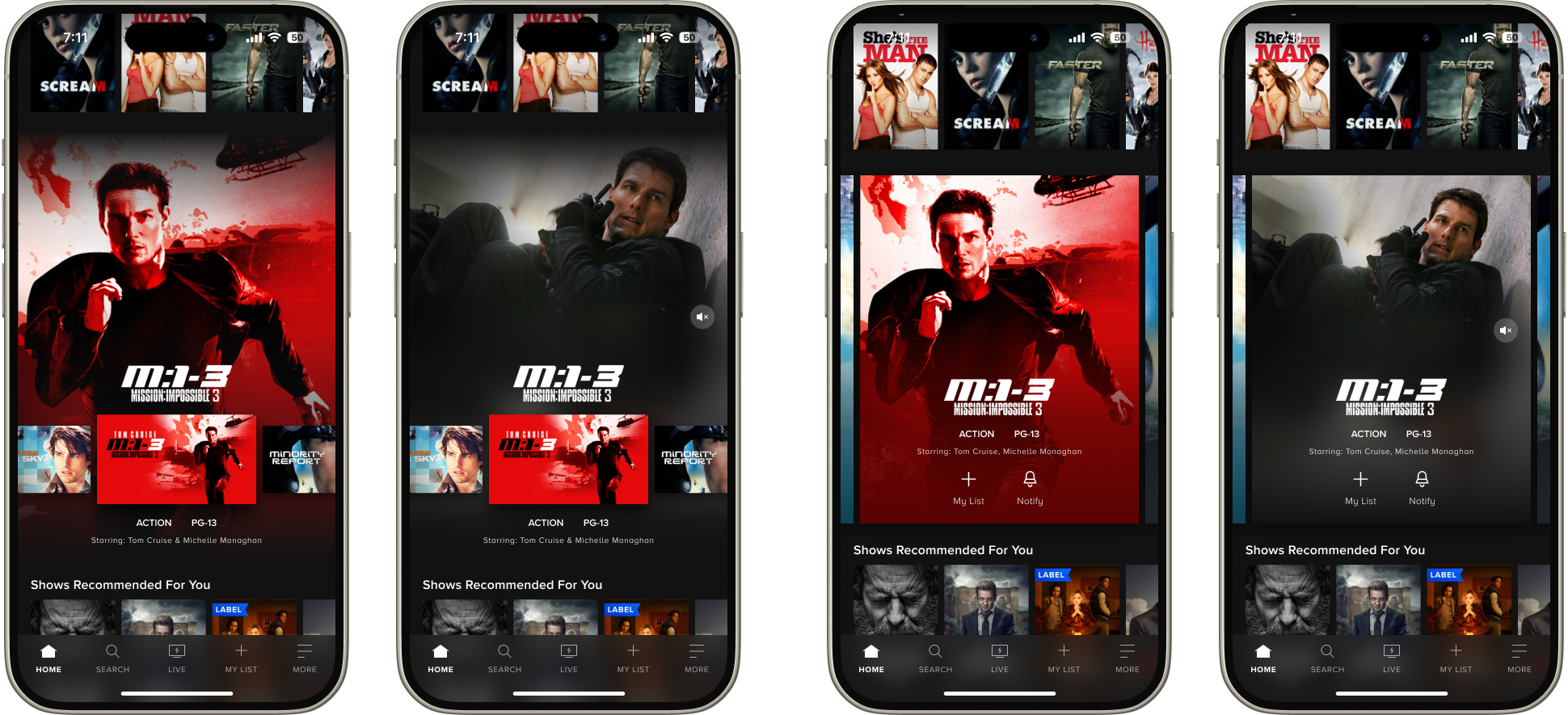
Dissecting the design with dev
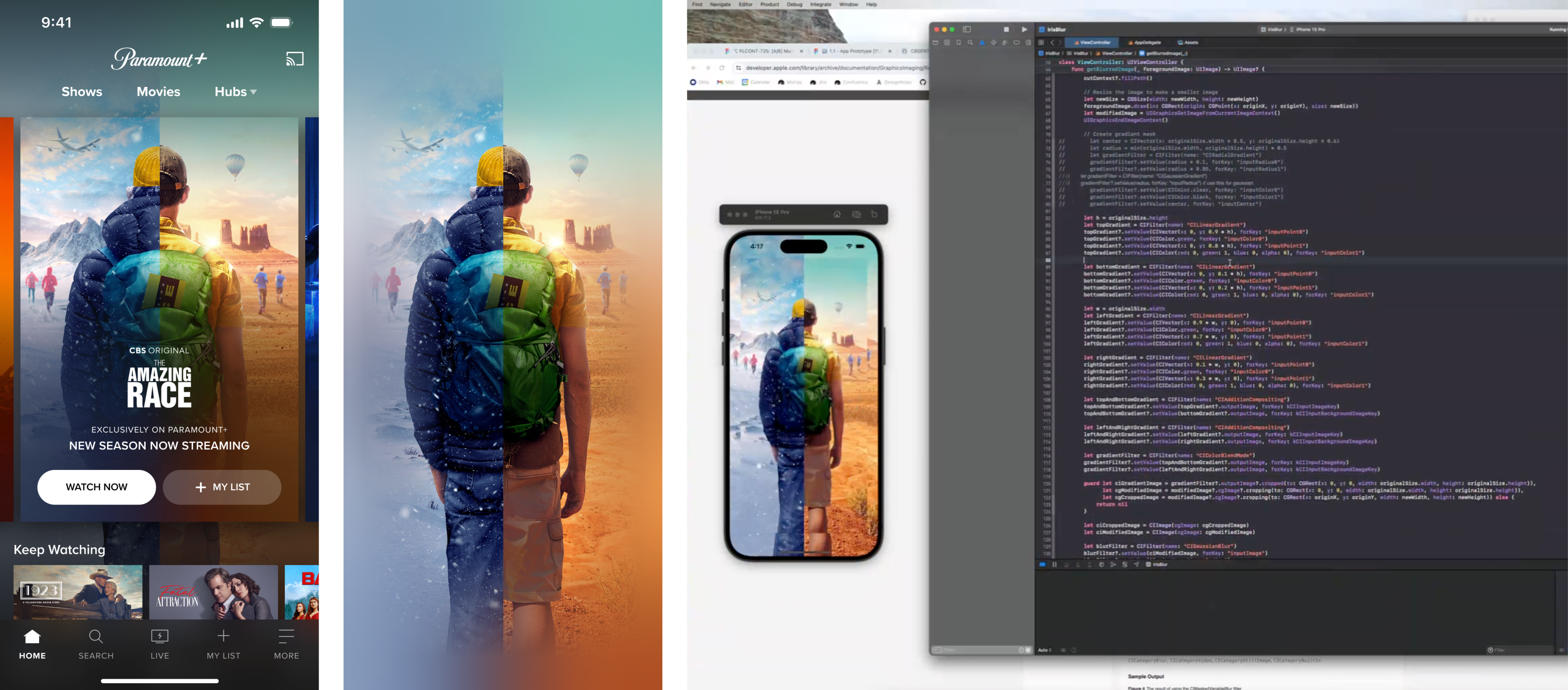
- The background module was the most complex part of the design to translate into code as this included a filter effect that involved reflecting the edges of a background image around its perimeter.
- The background image transformation scales it to match the width the card in the foreground, meaning we needed to create a visual effect that makes the scaled artwork appear like it's filling the viewport when it actually is not.
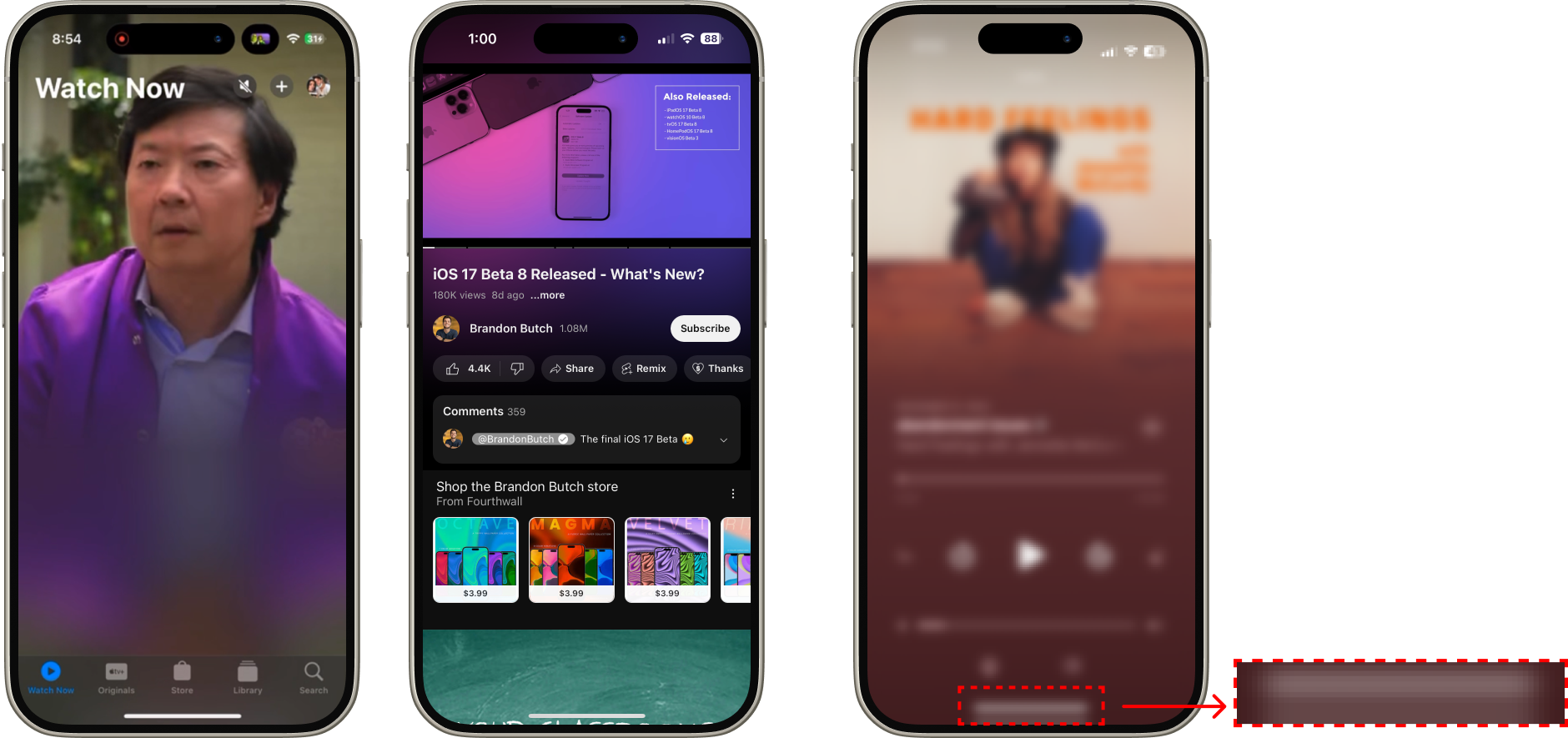
Competitor references: Mirror effects
Finding a solution
.png)
- I worked closely with developers throughout implementation to establish specs that could dynamically apply a blur and reflection filter effect to any image we place in the marquee.
- These filter effects were nested inside a programmatically created alpha gradient mask, carefully constructed to avoid exposing the edges of the transformed image.
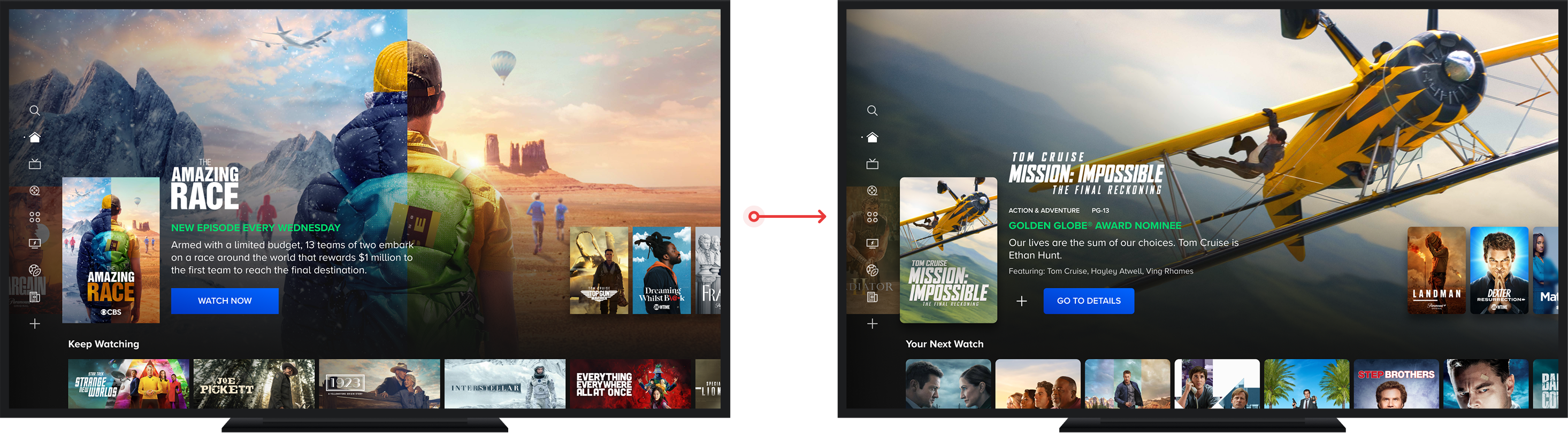
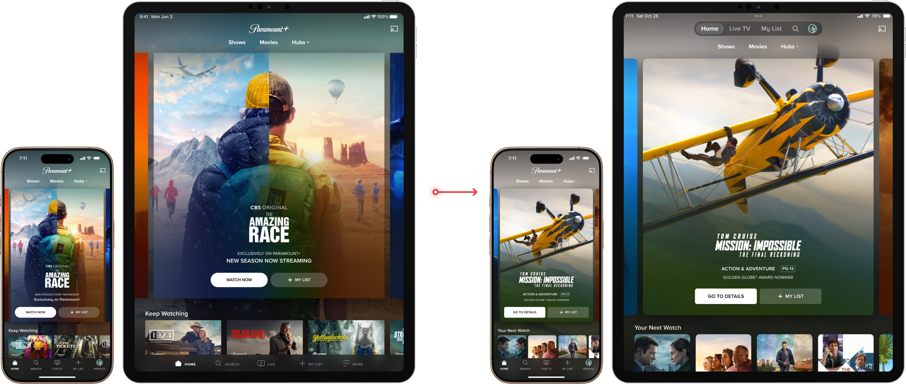
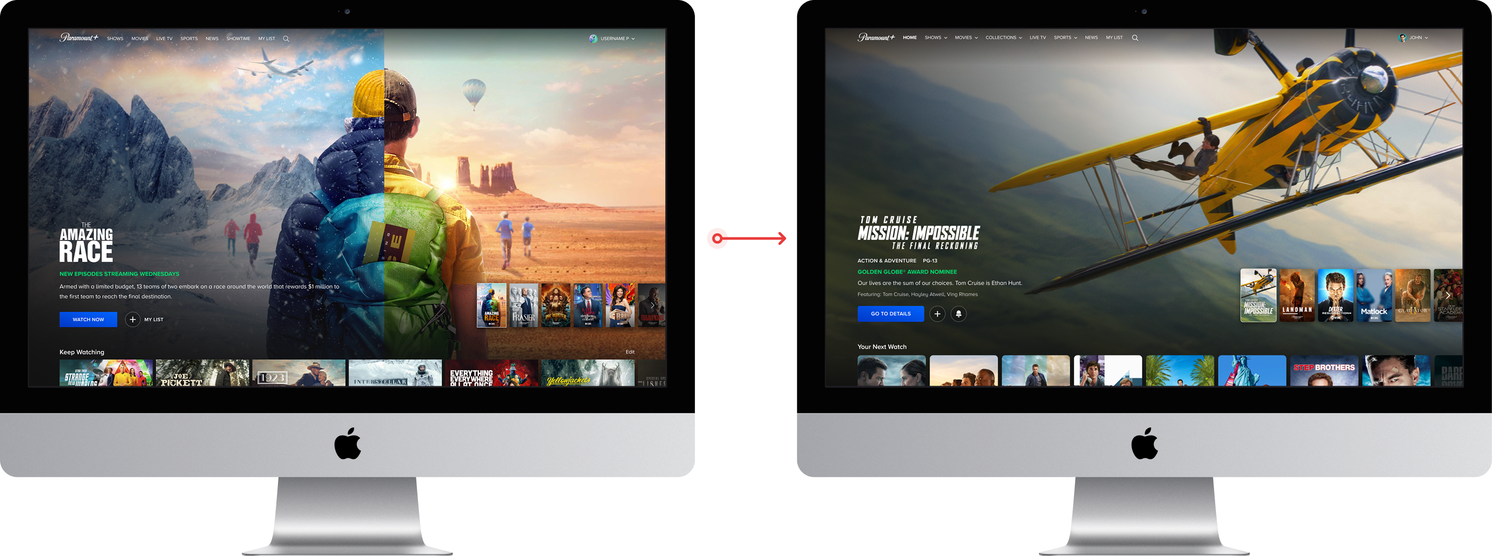
WHERE WE LANDED
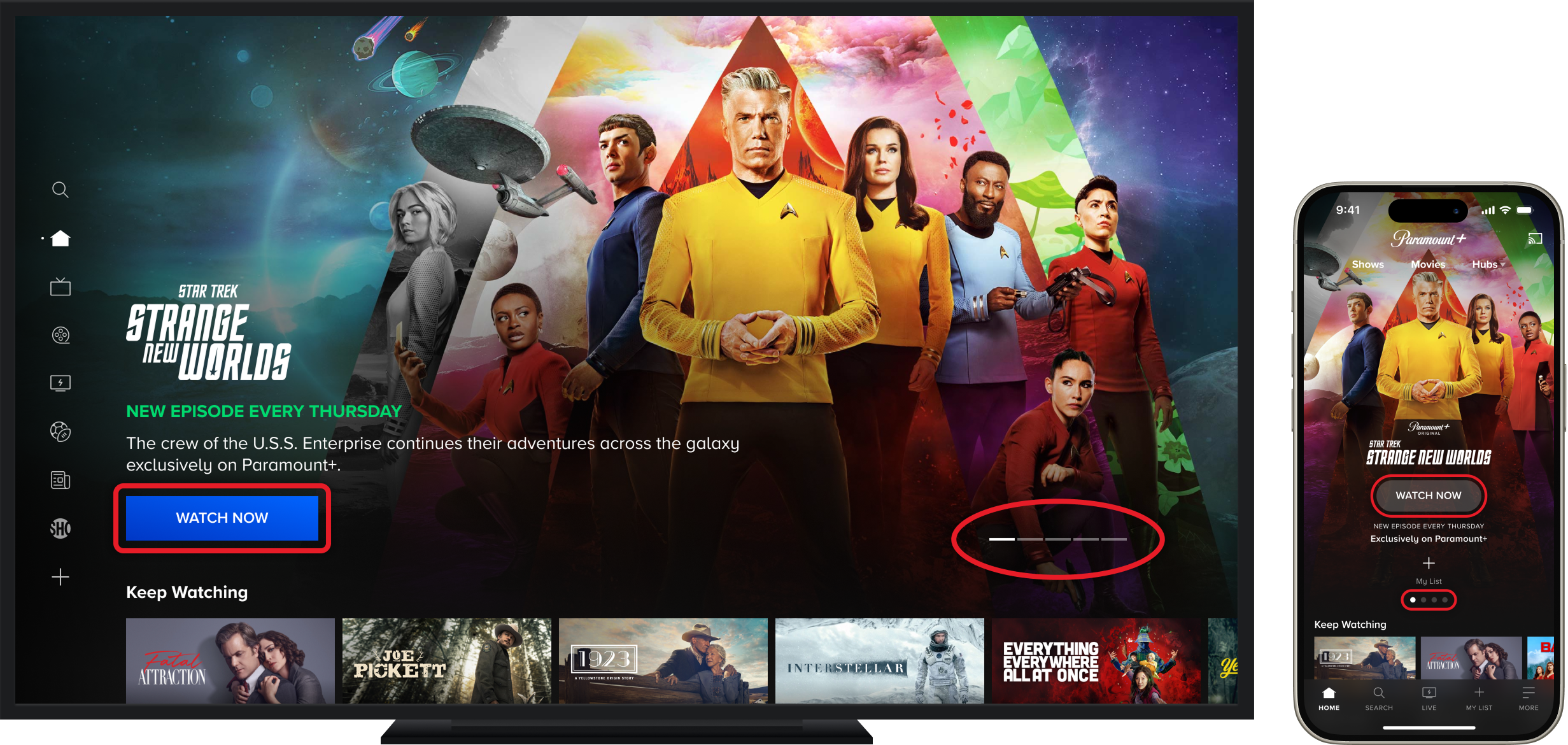
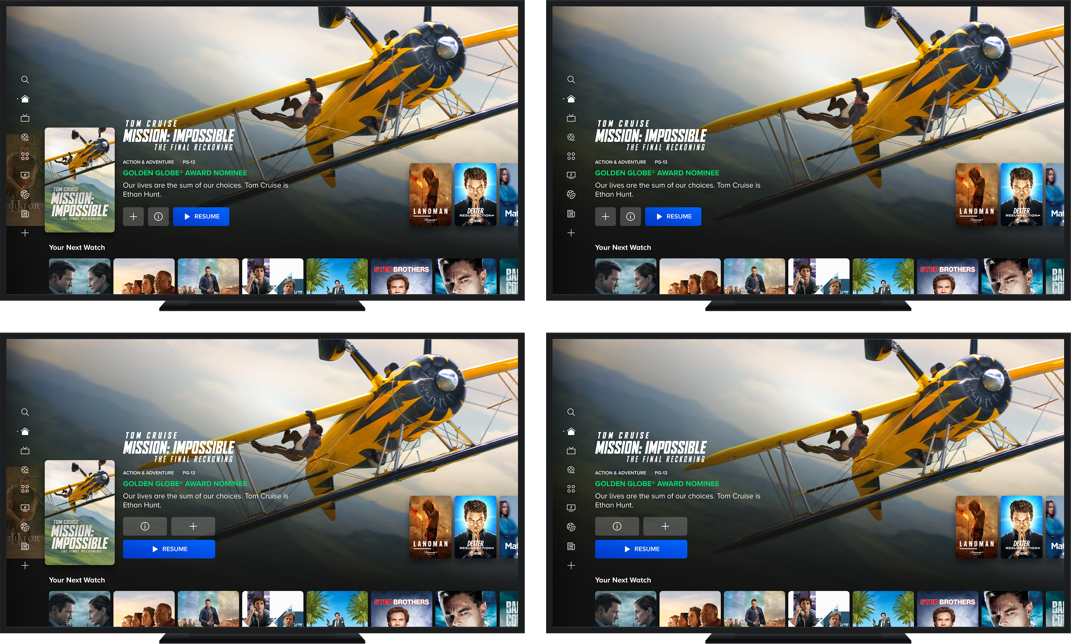
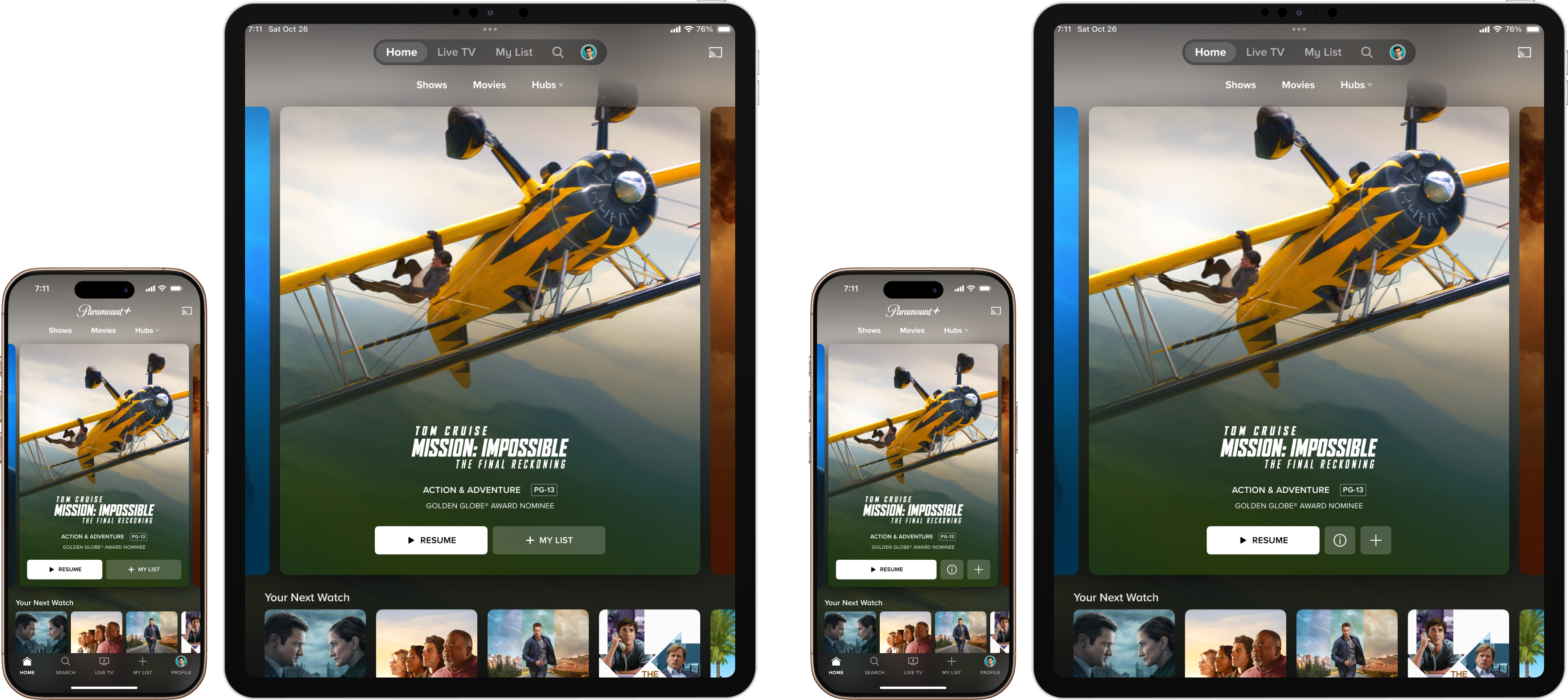
Validating the selector pattern
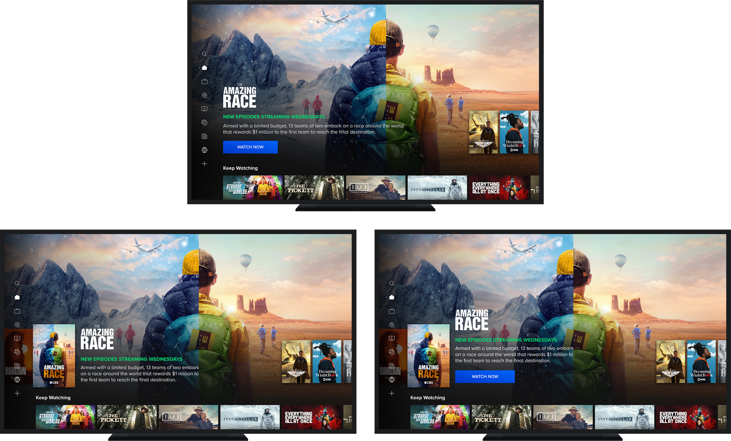
Fire TV test: Control, Variant 1, Variant 2
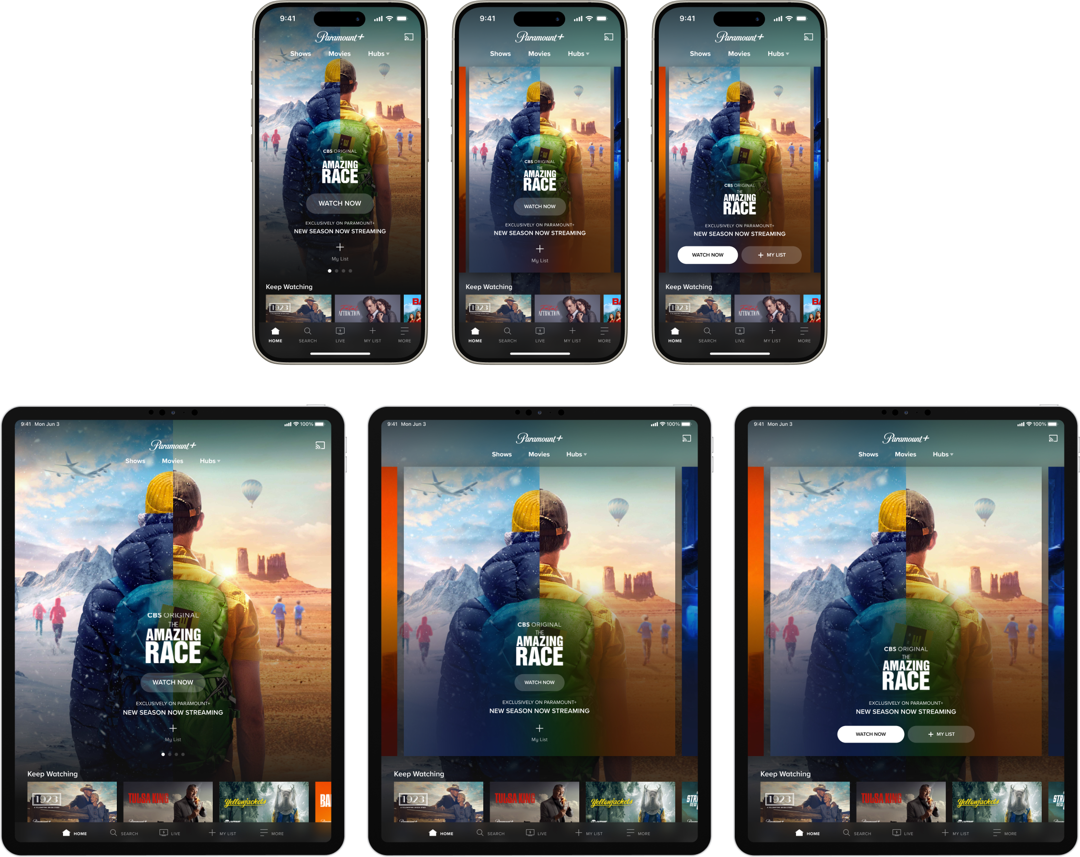
iOS & iPadOS test: Control, Variant 1, Variant 2
Web test: Control, Variant 1, Variant 2
Phase 2 ultimately became focused around measuring the effectiveness of a poster selector vs. a button selector as a wayfinding mechanism and entry point into the active marquee item. Since interaction expectations differ across TV, mobile, and web, we needed to validate which pattern translated best across input types. The intent was to find the approach that most consistently increased clicks and discoverability, while reducing the cognitive load of getting from browsing into watching.
- Fire TV Results - Variant 2 Wins
- Marquee CTR: +5%
- Marquee Video Mins: +10.08%
- Marquee Video Plays: +2.14%
- iOS Results - Variant 2 Wins
- Marquee CTR: +91.95%
- Marquee My List Button & Primary CTA: +87.88%
- My List Only: +50.75%
- Avg Homepage Video Plays (marquee): +44.1%
- Avg Content Discovery (marquee): +30.4%
- Web Results - Control Wins
- Web users already understood how to browse the marquee from the peek alone, so the poster selector added visual noise without solving a real navigation problem.
In Development
Building on Spotlight for personalization
TV
Mobile & Tablet
Web
- Migrating the Home and Hub page marquees to the Spotlight Marquee component, the same flexible, placement-agnostic unit built to scale across 5+ surfaces, establishing the infrastructure needed to introduce personalization into the highest-visibility surface on the homepage
- Designing the Spotlight Marquee to support mixed content types, hub promotions, and DMA-targeted live channels within a single unit, ensuring the component can flex to serve editorial, promotional, and personalized content without requiring surface-specific workarounds
- Designing for scalability from the start, ensuring the Spotlight Marquee architecture can support future personalization layers, contextual CTA configuration, and promotion overrides without structural redesign across platforms
Prototypes
Interaction layer
iOS A/B test
What's Next
Resolving CTA intent mismatch
Fire TV CTA test: Variant 1-4
iOS CTA test: Variant 1 & 2
- Extend a web-proven CTA pattern to TV and mobile, building on research showing "Watch Now" acted as a discovery barrier by creating ambiguity around whether clicks would immediately trigger playback
- Test contextual labels ("WATCH S1 E3", "RESUME S2 E4") that surface a user's exact watch state, reducing friction between the hero and playback
- Define success as net-positive ecosystem impact, measuring marquee CTR and engaged video plays with homepage and overall video minutes as guardrails
- Compare horizontal versus vertical CTA layouts across four Fire TV variants to identify the most usable interaction pattern before committing to a cross-platform design direction
Fire TV: Winning Variant
- Variant 1 won decisively, lifting marquee CTR by +14.6% and engaged video plays by +10.6% while holding overall video plays and minutes flat, confirming that contextual CTAs drive engagement without cannibalizing watch behavior elsewhere on the page.
- The active poster carried more weight than the CTA arrangement, with poster-included variants outperforming poster-removed ones on every primary metric, validating the wayfinding role of the selector pattern established in earlier marquee phases.
- Downstream effects extended beyond the marquee, with My List adds increasing +11.9% across all surfaces and overall homepage CTR lifting +3.5%, signaling that resolving the CTA intent mismatch unlocked engagement that had been suppressed at the top of the funnel.